import seaborn as sns
import matplotlib.pyplot as plt
import pandas as pdLab 2 - Data visualization
Introduction
This lab will begin your journey honing your data science workflow.
Learning objectives
By the end of the lab, you will…
Gain practice writing a reproducible report using Quarto
Continue practice with version control using Git and GitHub
Be able to create data visualizations using
seaborn
Getting started
Clone the repo & start new VS Code window
Go to the course organization at github.com/INFO-511-S25 organization on GitHub. Click on the repo with the prefix lab-2. It contains the starter documents you need to complete the lab.
Click on the green CODE button, select Use HTTPS (this might already be selected by default). Click on the clipboard icon to copy the repo URL.
In VS Code, go to File ➛ New Window ➛Clone Git Repository (under Start).
Copy and paste the URL of your assignment repo into the dialog box Provide repository URL or pick a repository source.
Click lab-2.ipynb to open the template Jupyter notebook file. This is where you will write up your code and narrative for the lab.
Also see similar steps within the Setting up Python page on the course website.
Packages
In this lab, we will work with the seaborn library, which is a powerful Python library for creating data visualizations.
Run All in the document which loads these packages with the import function.
The seaborn library is built on top of matplotlib and closely integrated with pandas. It provides a high-level interface for drawing attractive and informative statistical graphics.
Guidelines
As we’ve discussed in lecture, your plots should include an informative title, axes should be labeled, and careful consideration should be given to aesthetic choices.
Remember that continuing to develop a sound workflow for reproducible data analysis is important as you complete the lab and other assignments in this course. There will be periodic reminders in this assignment to remind you to Run all, commit, and sync your changes to GitHub. You should have at least 3 commits with meaningful commit messages by the end of the assignment.
Questions
Part 1
Let’s take a trip to the Midwest!
We will use the midwest data frame for this lab.
midwest = pd.read_csv('data/midwest.csv')The data contains demographic characteristics of counties in the Midwest region of the United States.
In the future, you will be expected to load the data.
Question 1
Visualize the distribution of population density of counties using a histogram with sns.histplot() with four separate binwidths: a binwidth of 100, a binwidth of 1,000, a binwidth of 10,000, and a binwidth of 100,000.
For example, you can create the first plot with:
# Create the histogram with binwidth = 100
sns.histplot(midwest['popdensity'], binwidth=100)
plt.xlabel('Population Density')
plt.ylabel('Count')
plt.title('Population Density of Midwestern Counties\nBinwidth = 100')
plt.show()
You will need to make four different histograms. Make sure to set informative titles and axis labels for each of your plots .Then, comment on which binwidth is most appropriate for these data and why.
Run all, commit, and sync your changes to GitHub with the commit message “Added answer for Question 1”.
Make sure to commit and push all changed files so that your Git pane is empty afterward.
Question 2
Visualize the distribution of population density of counties again, this time using a boxplot with sns.boxplot(). Make sure to set informative titles and axis labels for your plot. Then, using information as needed from the box plot as well as the histogram from Question 1, describe the distribution of population density of counties and comment on any potential outliers, making sure to identify at least one county that is a clear outlier by name in your narrative and commenting on whether it makes sense to you that this county is an outlier. You can use the data viewer to identify the outliers interactively, you do not have to write code to identify them.
Run all, commit, and sync your changes to GitHub with the commit message “Added answer for Question 2”.
Make sure to commit and push all changed files so that your Git pane is empty afterward.
Question 3
Create a scatterplot of the percentage below poverty (percbelowpoverty on the y-axis) versus percentage of people with a college degree (percollege on the x-axis), where the color and shape of points are determined by state. Make sure to set informative titles, axis, and legend labels for your plot. First, describe the overall relationship between percentage of people with a college degree and percentage below poverty in Midwestern states, making sure to identify at least one county that is a clear outlier by name in your narrative. You can use the data viewer to identify the outliers interactively, you do not have to write code to identify them. Then, comment on whether you can identify how this relationship varies across states.
Run all, commit, and sync your changes to GitHub with the commit message “Added answer for Question 3”.
Make sure to commit and push all changed files so that your Git pane is empty afterward.
Question 4
Now, let’s examine the relationship between the same two variables, once again using different colors and shapes to represent each state, and using a separate plot for each state, i.e., with faceting using sns.FacetGrid. In addition to points (sns.scatterplot()). Make sure to set informative titles, axis, and legend labels for your plot. Which plot do you prefer - this plot or the plot in Question 3? Briefly explain your choice.
Run all, commit, and sync your changes to GitHub with the commit message “Added answer for Question 4”.
Make sure to commit and push all changed files so that your Git pane is empty afterward.
Question 5
Do some states have counties that tend to be geographically larger than others?
To explore this question, create side-by-side boxplots of area (area) of a county based on state (state). How do typical county area sizes compare across states? How do variabilities of county sizes compare across states? Which state has the single largest county? Identify the name of this county. You can use the data viewer to identify it interactively, you do not have to write code.
Now is another good time to Run all, commit, and sync your changes to GitHub with a meaningful commit message.
Once again, make sure to commit and push all changed files so that your Git pane is empty afterwards.
Question 6
Do some states have a higher percentage of their counties located in a metropolitan area?
Create a segmented bar chart with one bar per state and the bar filled with colors according to the value of metro – one color indicating Yes and the other color indicating No for whether a county is considered to be a metro area. The y-axis of the segmented barplot should range from 0 to 1, indicating proportions. Compare the percentage of counties in metro areas across the states based on this plot. Make sure to supplement your narrative with rough estimates of these percentages.
For this question, you should begin with the data wrangling pipeline below. We will learn more about data wrangling in the coming weeks, so this is a mini-preview. This pipeline creates a new variable called metro based on the value of the existing variable called inmetro. If the value of inmetro is equal to 1 ('Yes' if x == 1), it sets the value of metro to “Yes”, and if not, it sets the value of metro to “No”. The resulting data frame is assigned back to midwest, overwriting the existing midwest data frame with a version that includes the new metro variable.
midwest['metro'] = midwest['inmetro'].apply(lambda x: 'Yes' if x == 1 else 'No')Now is another good time to Run all, commit, and sync your changes to GitHub with a meaningful commit message.
And once again, make sure to commit and push all changed files so that your Git pane is empty afterward. We keep repeating this because it’s important and because we see students forget to do this. So take a moment to make sure you’re following along with the version control instructions.
Question 7
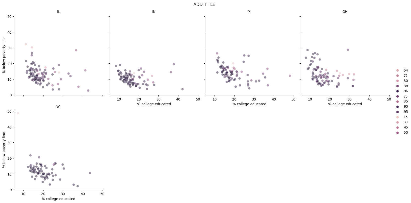
Recreate the plot below, and then give it a title. Then, identify at least one county that is a clear outlier in Wisconsin (WI) by name. You can use the data viewer to identify them interactively, you do not have to write code. Comment on the population composition of this county by investigating the percentage of other races living there.

- The
seabornreference for themes in the Python Graph Gallery will be helpful in determining the theme. - The
size of the points is 50. - The transparency (
alpha) of the points is 0.5. - You can put line breaks in labels with
\n.
Run all, commit, and sync your final changes to GitHub with a meaningful commit message.
Make sure to commit and push all changed files so that your Git pane is empty afterwards.
Part 2
Enough about the Midwest!
In this part we will use a new, more recent, and potentially more relevant dataset on counties in Arizona.
This dataset is stored in a file called az-county.csv in the data folder of your project/repository.
You can read this file into Python with the following code:
az_county = pd.read_csv('data/az-county.csv')This will read the CSV (comma separated values) file from the data folder and store the dataset as a data frame called az_county in Python.
The variables in the dataset and their descriptions are as follows:
county: Name of county.state_abb: State abbreviation (AZ).state_name: State name (Arizona).land_area_m2: Land area of county in meters-squared, based on the 2020 census.land_area_mi2: Land area of county in miles-squared, based on the 2020 census.population: Population of county, based on the 2020 census.density: Population density calculated as population divided by land area in miles-squared.
In addition to being more recent and more relevant, this dataset is also more complete in the sense that we know the units of population density: people per mile-squared!
Question 8
First, guess what the relationship between population density and land area might be – positive? negative? no relationship?
Then, make a scatter plot of population density (density on the y-axis) vs. land area in miles-squared (land_area_mi2 on the x-axis). Make sure to set an informative title and axis labels for your plot.Describe the relationship. Was your guess correct?
Question 9
Now make a scatter plot of population density (density on the y-axis) vs. land area in meters-squared (land_area_m2 on the x-axis). Make sure to set an informative title and axis labels for your plot. Comment on how this scatterplot compares to the one in Exercise 8 — is the relationship displayed same or different. Explain why.
Question 10
What are some insights that you found from the az_county data from Questions 8-9?
Wrap-up
Submission
Before you wrap up the assignment, make sure all of your documents are updated on your GitHub repo. We will be checking these to make sure you have been practicing how to commit and push changes.
You must turn in the .ipynb file by the submission deadline to be considered “on time”.
Make sure you have:
- attempted all questions
- run all code in your Jupyter notebook
- committed and pushed everything to your GitHub repository such that the Git pane in VS Code is empty
Grading
The lab is graded out of a total of 50 points.
On Questions 1 through 10, you can earn up to 5 points on each question:
5: Response shows excellent understanding and addresses all or almost all of the rubric items.
4: Response shows good understanding and addresses most of the rubric items.
3: Response shows understanding and addresses a majority of the rubric items.
2: Response shows effort and misses many of the rubric items.
1: Response does not show sufficient effort or understanding and/or is largely incomplete.
0: No attempt.
