import pandas as pd
import matplotlib.pyplot as plt
import seaborn as snsAE 03: Tucson Housing
Suggested answers
These are suggested answers. This document should be used as reference only, it’s not designed to be an exhaustive key.
Packages
Read in Data + wrangle
tucson_housing = pd.read_csv("data/tucsonHousing.csv")

garage_types = ["Single Family", "Townhouse"]

tucson_housing['garage'] = tucson_housing['type'].apply(lambda x: 'Garage' if x in garage_types else 'No garage')
Exercise 1
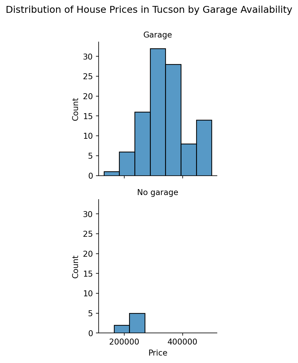
From the histograms, it appears that houses with garages (assumed based on house type) generally have a wider range of prices compared to those without garages. This suggests that having a garage might be associated with higher or more variable house prices in Tucson.
g = sns.FacetGrid(tucson_housing, row="garage")
g.map(sns.histplot, "price", kde=False, binwidth=50000)
g.set_axis_labels("Price", "Count")
g.set_titles("{row_name}")
g.fig.suptitle("Distribution of House Prices in Tucson by Garage Availability", y=1.05)
plt.show()
Exercise 2
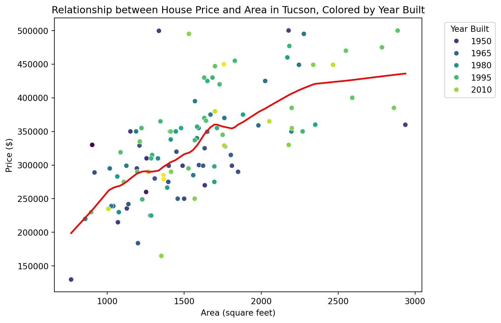
Claim 1: Larger houses are priced higher. The scatter plot shows a positive correlation between house area and price, indicating that larger houses tend to be priced higher.
Claim 2: Newer houses are priced higher. From the color gradient, it appears that newer houses (lighter colors) are generally more expensive, supporting the claim that newer houses are priced higher.
Claim 3: Bigger and more expensive houses tend to be newer ones than smaller and cheaper ones. The plot suggests that bigger and more expensive houses are often newer, as indicated by the clustering of lighter-colored points (newer houses) towards the upper right of the plot.
from statsmodels.nonparametric.smoothers_lowess import lowess

plt.figure(figsize=(8, 6))
scatter = sns.scatterplot(data=tucson_housing, x='area', y='price', hue='year_built', palette='viridis')

lowess_fit = lowess(tucson_housing['price'], tucson_housing['area'], frac=0.3)
lowess_x = [point[0] for point in lowess_fit]
lowess_y = [point[1] for point in lowess_fit]

plt.plot(lowess_x, lowess_y, color='red', linewidth=2)

plt.title('Relationship between House Price and Area in Tucson, Colored by Year Built')
plt.xlabel('Area (square feet)')
plt.ylabel('Price ($)')
plt.legend(title='Year Built', bbox_to_anchor=(1.05, 1), loc='upper left')

plt.show()
